Cathrin Gressieker - art + pattern
  • Instagram
  • Facebook
  • Custom 3
Menu
Skip to content
  • Home
  • About
  • Textile Design
  • Classes
  • Clients
  • Art
  • Contact
Sep252016Sep 25 2016

The September Collection

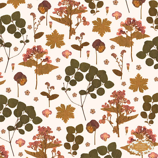
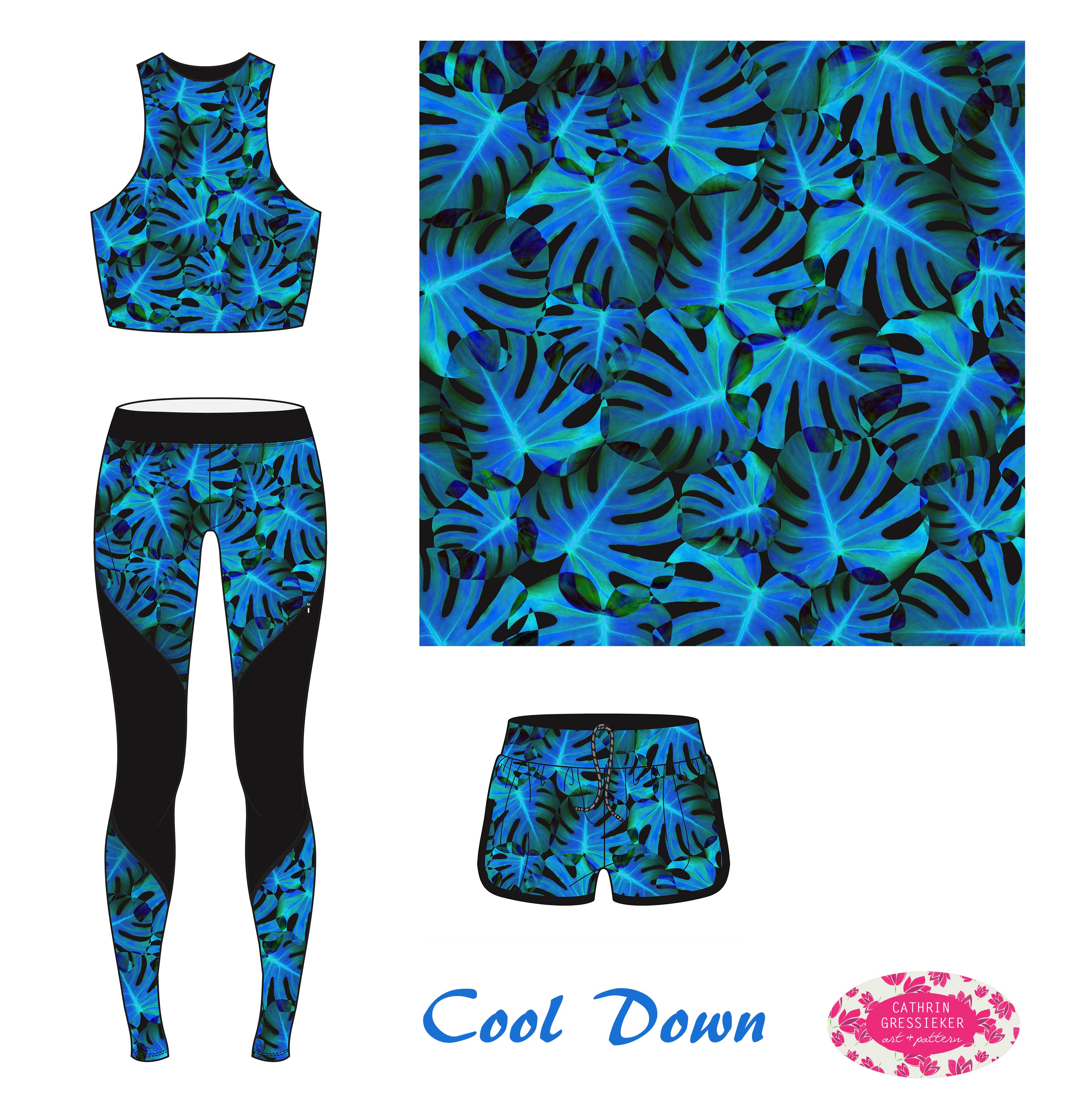
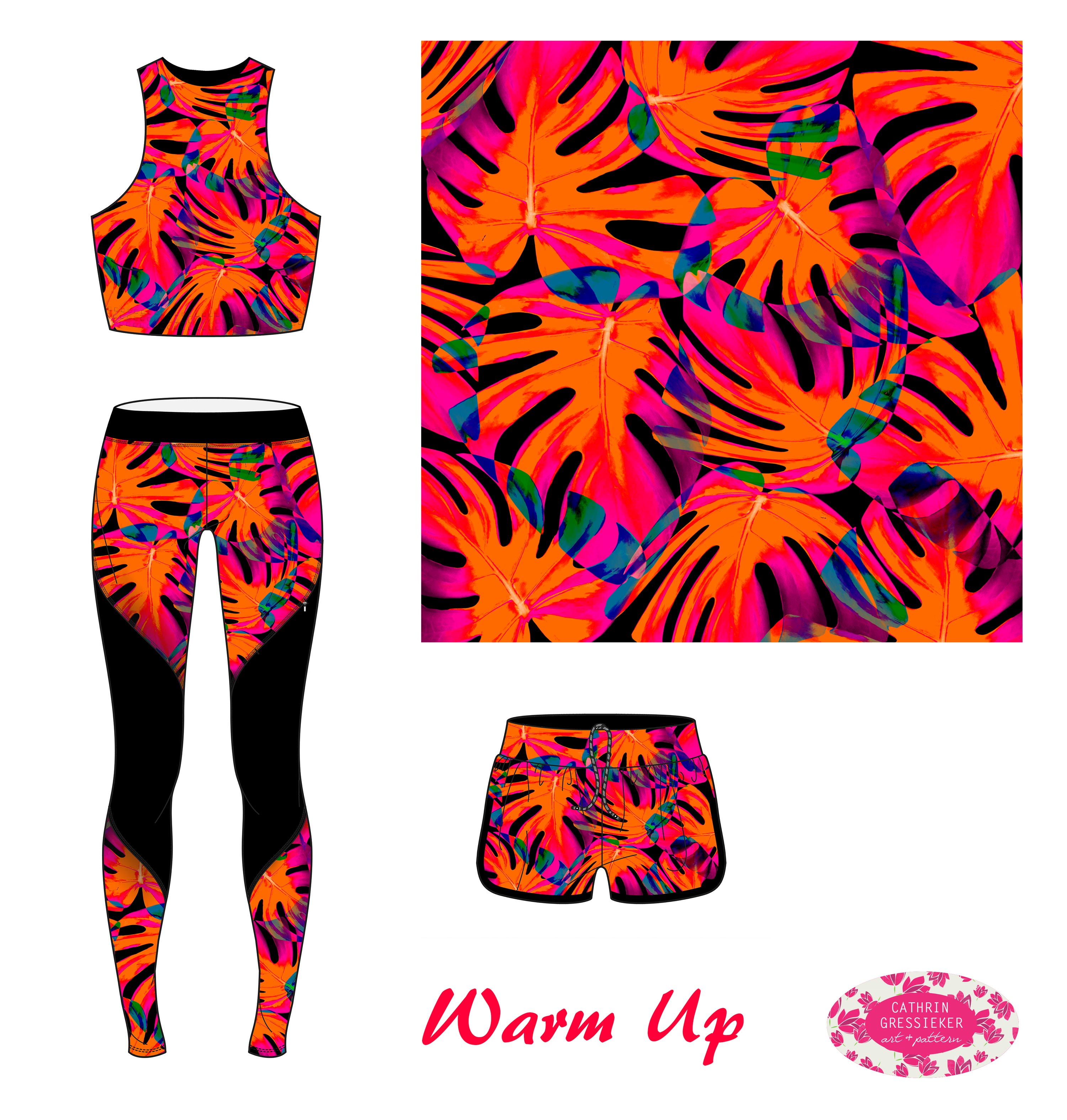
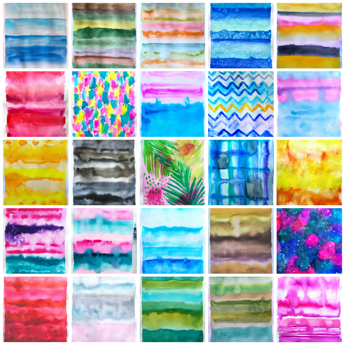
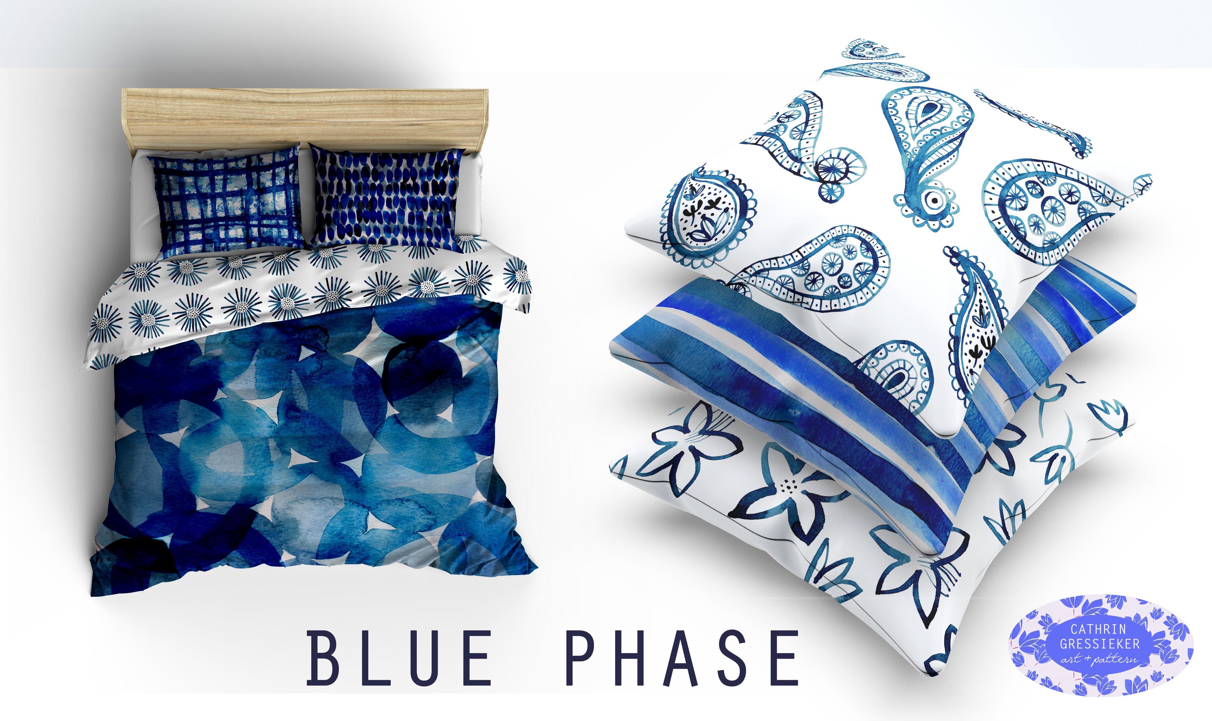
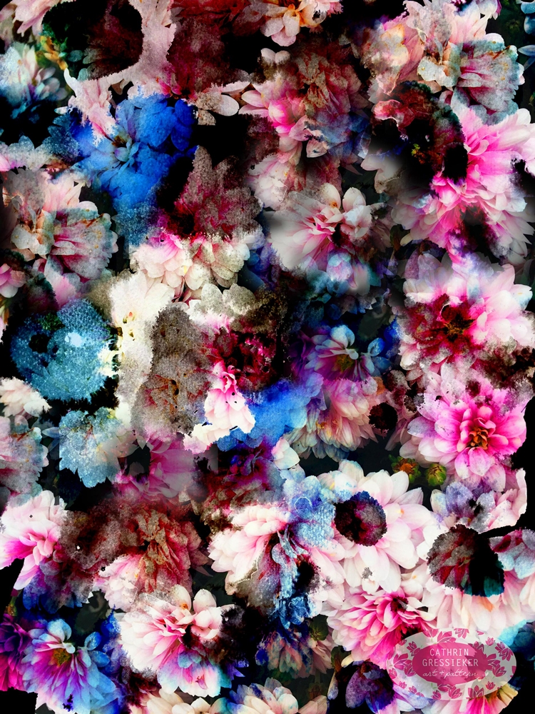
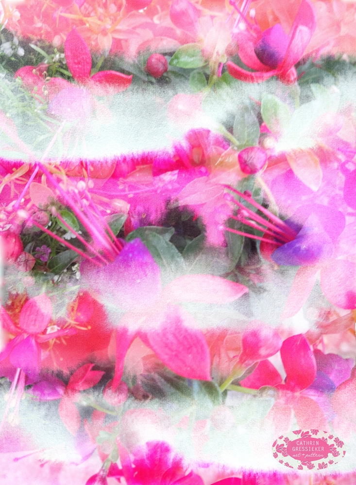
This month I played with layers, blend modes and overlays. I combined recent floral photography with hand painted textures of mine, mainly from my Daily Moods for my collection ‘Flora Translucens’.

Cathrin Gressieker_Flora Translucens1

Cathrin Gressieker_Flora Translucens2

Cathrin Gressieker_Flora Translucens6

These designs would look great on silk scarves, placement prints on T-Shirts or on iPhone cases, I think.

Cathrin-Gressieker_iphone-mockups

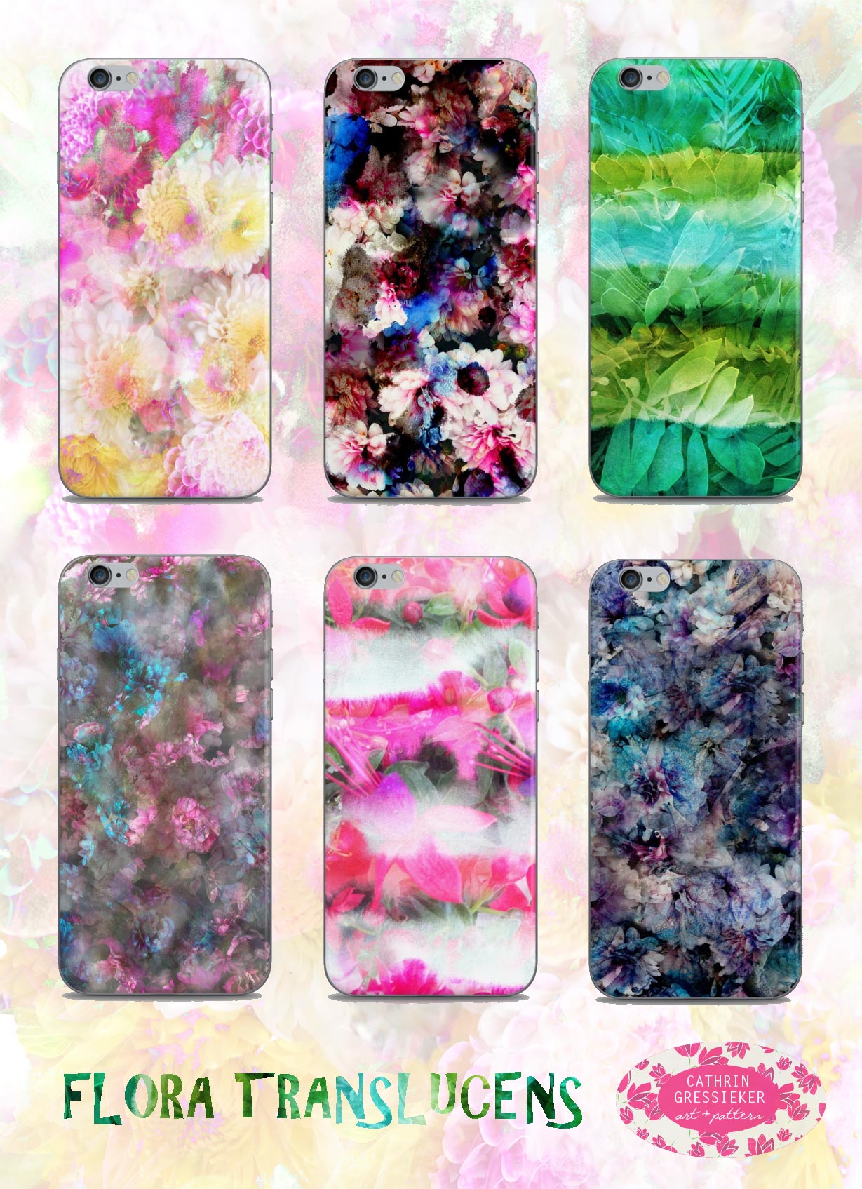
I liked them so much on the iPhone mock-ups, that I restocked my Society6 and Redbuddle online stores with these (and a whole lot more).

Speaking of iPhones, most of the floral photos and Daily Moods were photographed with my iPhone (my regular camera is quite neglected these days …) and I did basic editing on them also with an app and only then started working with them in Photoshop.

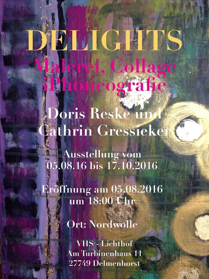
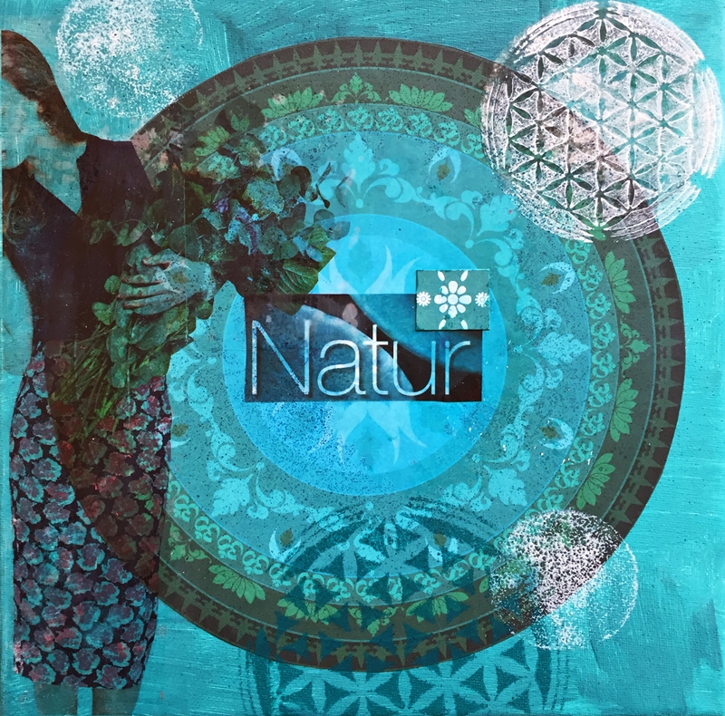
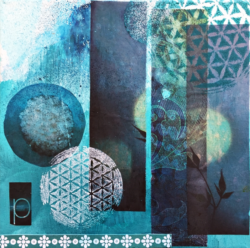
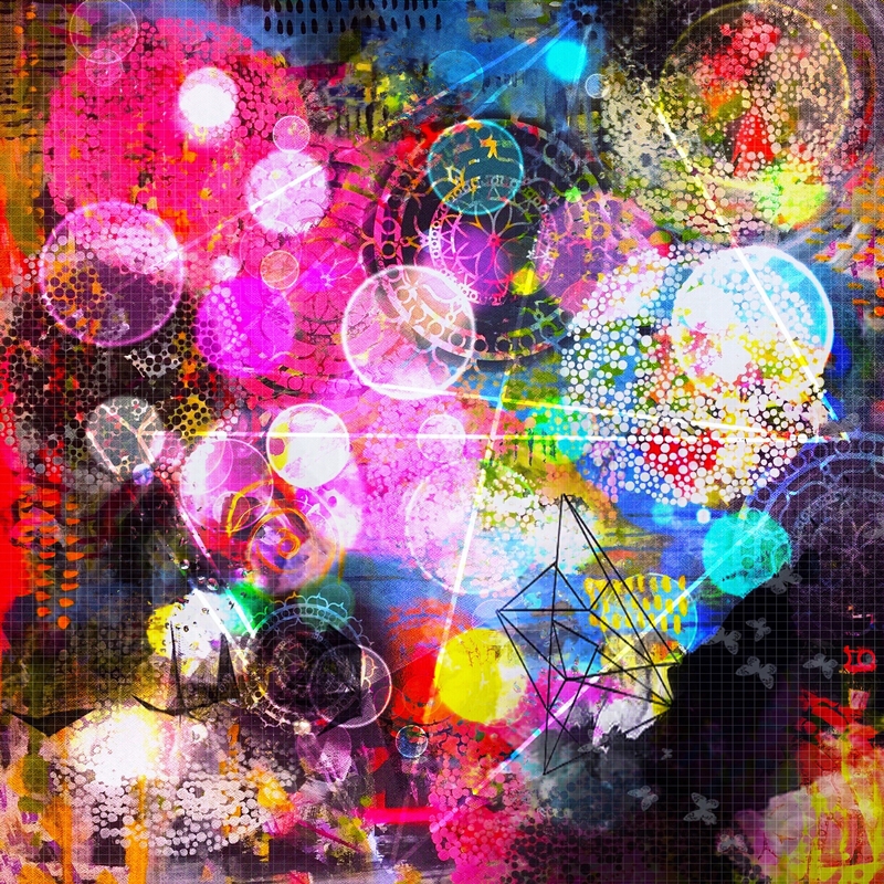
During our September Colab Painting session with Doris Reske, she taught me a couple of new things about iPhoneography and introduced me to a couple of cool apps with the result of a piece called ‘Mandala Universe’.

Cathrin Gressieker_Mandala Universe-k

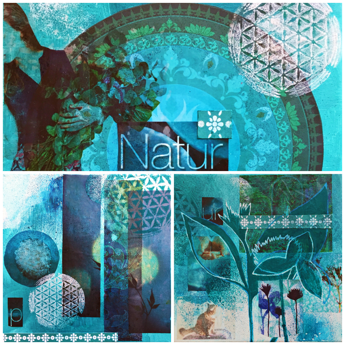
I couldn’t resist ordering one iPhone wallet case myself in my Redbubble store (is that how they make most of their money, with the vanity of artists?) And it quickly arrived a couple of days:

Cathrin Gressieker_Mandala Universe iPhone case

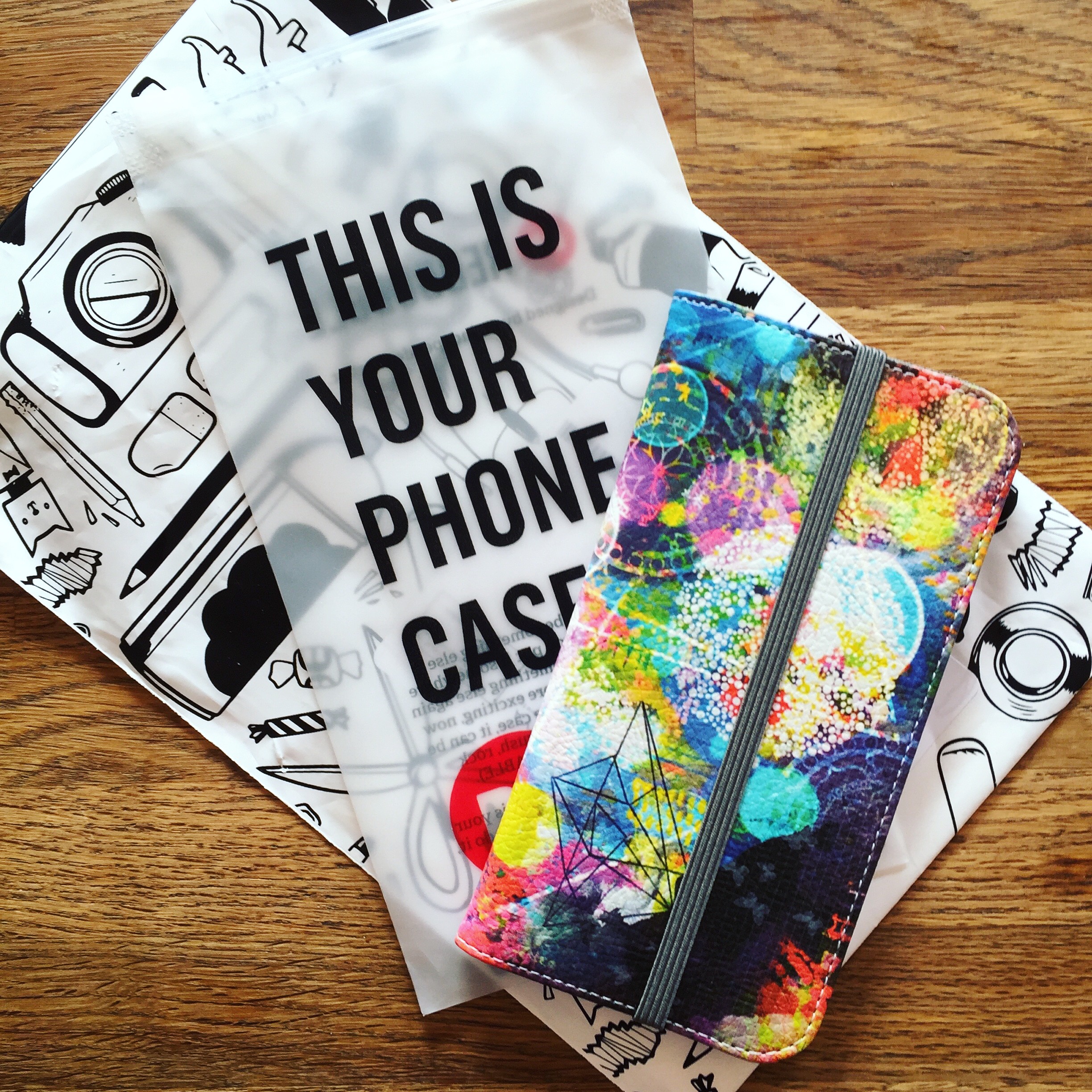
I am pleased with the quality and how the colours came out and the chemical smell luckily disappeared after a day. You can see the more ‘Mandala Universe’ products here. And now I stop my sales talk, which was not my intention at all, but isn’t it great envisioning your designs on products and actually having them in your hands?

Merken

Merken

Merken

Merken

Merken

Merken

Share
  • Pin it
  • Share
  • Tweet
  • Share
  • Email
  • Print
Aug272016Aug 27 2016

Design Summer School 2016

It is this time of year again – the design summer school with Make it in Design.

Cathrin Gressieker-SPD Lookbook 2

Shortly before this year’s briefs were sent out, they published their Surface Pattern Design Lookbook Volume 2 and I was delighted that two of my patterns from last summer’s school were published in it. You can find my designs on page 15 and 20.

But no time for resting on my laurels, I subscribed to all of the three offered tracks, beginner, intermediate and advanced, you never know what’s in store and what could be fun and fit my style – or make me try something new. The briefs were full of trends for the coming summer next year, with a lot of inspiration from trend companies like WGSN and Patternbank (by the way, do you know, that I license some of my designs with them).

For the first design round I focused on a brief called Honest Meadow Land and developed a pattern with dried flowers, that I had picked and dried in spring and had just waited for their pattern time to come:

Cathrin-Gressieker_INT-CB1

I wanted to give the pattern the look of an aged and faded botanical book, so I tried different filters in Photoshop to achieve the effect. You can see the whole gallery with all the beautiful entries here.

For the second design round I developed three pattern concepts according to the briefs. I challenged myself to only use colours from the provided colour palettes and see what could look good together.

handmarks1

Honest Hand Marks gallery here

(that’s actually the result of me playing with bubble wrap textures)

Print

 Escape/Souk gallery here

(this pattern is based on a sketch from my recent Montenegro travel sketchbook)

Print

Treasured / Summer Botanicals gallery here

(here I worked with a new technique I recently learned in Illustrator, with converting photos to textures and colouring them)

That was an inspiring month of August that made me experiment with new techniques, themes and colour palettes. And it is always fun to design summer pattern, simply my favourite time of year.

Merken

Merken

Merken

Merken

Merken

Merken

Merken

Merken

Merken

Merken

Merken

Merken

Share
  • Pin it
  • Share
  • Tweet
  • Share
  • Email
  • Print
Aug142016Aug 14 2016

My Moods Movie

Last Sunday was the last day of my summer vacation and totally incidentally also the last day of my 100-day-project. Some say it takes 21 days to form a new habit, others say 28 or 66 days. So 100 days are plenty! I started on April 27 2016 and painted my 100 days all through spring and summer. At home and then later travelling in Montenegro. And I loved, loved, loved it. That love didn’t go away. I wrote about it 14 days into the project and later at 50 moods.

To celebrate the completion of #the100dayproject I put my moods into a movie:

Cathrin Gressieker_Mood Movie

These are all the Daily Moods that I painted when I was at home. For my time of summer travelling I took another sketchbook with me that is a square format. It is filled with daily moods that are heavily influenced by each beautiful place we visited, glorious days at the Mediterranean sea along with other sketches.

Cathrin Gressieker_Summer Sketchbook 2016

So, that’s it? No way! I have formed a creative habit now that I love and turned it into a 365-day-project. This kind of play with colours and shapes in my sketchbook is just too much fun and I want to keep up the daily momentum. While the painting process is all about experimentation, exploration and fun for me and I do it just for the sake of it, these Daily Moods sometimes turn into the beginnings of pattern designs and paintings, may it be for an interesting colour palette, texture or something I would love to explore further. And as each day is a new day, fresh and unique with possibilies for growth, change and happiness, I love seeing these Daily Moods reflecting that.

Share
  • Pin it
  • Share
  • Tweet
  • Share
  • Email
  • Print
Aug62016Oct 10 2016

DELIGHTS

Last night our biggest (up-to-now) art show opened in Delmenhorst, Germany.

DELIGHTS Reske Gressieker

Doris Reske and me show 65 pieces of art on the tree floors of the Lichthof-Gallery which is part of the former Nordwolle fabric area.

Reske Gressieker DELIGHTS Delmenhorst

Large acrylic paintings (quite a few of them collaborations), mixed-media collages by me and iPhoneography prints by Doris show the range of our work from the last two years.

DELIGHTS Reske Gressieker

The exhibition is open to the public until Mid-October and in case you know some German, here is a good article about our show.

Merken

Merken

Merken

Merken

Merken

Share
  • Pin it
  • Share
  • Tweet
  • Share
  • Email
  • Print
Jul272016Jun 14 2018

The Summer Sports Collection

As my summer sabbatical is slowly but definitely coming to its end, it is time for me to catch up on some of my developments in pattern design on my blog. Before my vacation I took an excellent 4-week-online course Women’s Activewear with Pattern Observer. Being also a yoga teacher I have seen a lot of growth in the sportswear and “Athleisure” market recently, with more and more great designs on leggings etc.

I would like to share some of patterns that I designed during this course. They are intended for the spring/summer 2018 season, inspired by the super-cool WGSN trend Psychotropical.  As you might know, I totally love everything tropical and travelling to tropical countries and the “psycho” aspect of this trend is also quite stimulating. For my designs I had this concept of “cooling down” and “warming up” during workouts in my mind. My motif are philodendron leaves.

Cathrin-Gressieker-Cool-Down

The “cool-down” pattern could help feeling fresh while actually working up a sweat.

Cathrin-Gressieker-Warm-UpThe “warm up” pattern reminds of of these body temperature scans, that show how warm different areas of your body are and it comes in a psychedelic colourway.

Being on a roll, I also designed some more textural patterns:

rainforest walk
rainforest walk
sporty spice
sporty spice
morning run
morning run

These designs are exclusively available for licensing with the Patternbank agency. I was also a Featured Designer on the Patternobserver blog with my workshop experience.

Merken

Merken

Merken

Merken

Merken

Merken

Merken

Merken

Merken

Merken

Merken

Merken

Share
  • Pin it
  • Share
  • Tweet
  • Share
  • Email
  • Print
Jun182016

Daily Moods – Halftime

This morning I painted my 50th morning mood of my 100-day-project. So I thought it was time for a little update since I started the project a good 1,5 months ago. I am still doing them. Every single morning. Never missed once (ok, I missed one weekend when I forgot to take my art supplies with me on a trip). I just love it, it is the first project I have stuck to that long. Here is a selection:

Cathrin Gressieker 50 100 collage

Some days it is a feeling or a certain colour combination I would like to paint, sometimes I sense it already in my waking-up-phase, some days I have no idea at all and just start with the colour that appeals most to me at that given moment, most of the times I am surprised by the result. This project has seen me buying and trying out new watercolours and inks.

Some days I am more courageous than others – and I am totally looking forward to painting another 50 moods. There will be a couple of changes as we will be going on our summer holiday next week, probably a different sketchbook in a square format, a simple travel watercolour kit, but usually I thrive on limited supplies, giving me a certain freedom within these limitations. And there will be so much inspiration – new places, new people, new colours, new sensations, new adventures, new moods! I will keep you posted.

Merken

Share
  • Pin it
  • Share
  • Tweet
  • Share
  • Email
  • Print
Jun72016

The Teal Series – a painting commission

In October I was contacted by a former yoga student of mine whom I had met again at an arts & crafts fair last year. She asked me if I could create a little painting series for a friend’s birthday. We had a look through my portfolio to find a theme and creative direction for the series and the client also put together a beauti- and helpful moodboard. Her friend was interested in gardening, (spiritual) growth, femininity and was a cat lover. And she also had a favourite colour – teal, something there was very little of in my portfolio.

Cathrin Gressieker Alina1

We decided upon three canvases sized 20 x 20 cm, I mixed some teal acrylic colour and started the series. Collage came naturally to me for this project, especially my favourite image transfers. I also did some layering with stencils, spray paint and paint pen.

Cathrin Gressieker Alina2

I haven’t expected to have so much fun with this projects, working with unusual-for-me colours and motifs, but totally immersing myself into another person’s personality or my interpretation of it. And there is still something of “me” in the paintings.

Cathrin Gressieker Alina3

The feedback from the client was wonderful. This birthday present was in her words “a total success” and her friend was very happy with it.

Cathrin Gressieker_ Alina collage2

So if you are also looking for a personalised gift, feel free to contact me.

Merken

Merken

Merken

Merken

Merken

Merken

Merken

Merken

Merken

Merken

Merken

Merken

Merken

Merken

Share
  • Pin it
  • Share
  • Tweet
  • Share
  • Email
  • Print
May292016

The May Collection

While we had a stretch of warm summerlike days in early May, I designed a couple of wintry patterns to a trend called Ice Princess – the monthly theme in the Textile Design Lab by Pattern Observer. That’s what surface pattern design is often like – Christmas cards in June and bikini patterns ins December.

The Ice Princess trend focuses on a palette of blues, brown and neutrals with motifs like e.g. glacial landscapes, frost coveres branches and flowers, and geometrics based on diamonds and crystalline structures.

Cathrin-Gressieker_ice-queen-pattern-collection
mock-up photo: FORMA photography via www.http://www.theprettyblog.com/wedding/a-white-wonderland

My Ice Queen collection is a mix of geometrical and textural patterns with a cohesive colour palette that would be ideal for women’s apparel and even sportswear. Speaking of sportswear, in June I will be taking an online course Women’s Activewear by Pattern Observer and I already have a strong feeling that my June Collection will be very much influenced by it.

Share
  • Pin it
  • Share
  • Tweet
  • Share
  • Email
  • Print
May102016Aug 14 2016

100 Days of Daily Moods

About three weeks ago a lot of posts started showing up in my Instagram feed with people announcing their coming #the100dayproject, starting the next day on April 19. I had heard about the project before, thinking you can start doing it anytime (which you can do, of course!), but this time it was announced by Elle Luna and it quickly gained momentum. But I already felt too busy with all my other projects and couldn’t quickly think of a project that I could squeeze in on top and enjoy. I enjoyed looking at the projects other artists were posting and that was it.

Then one week into the project, inspired by the super-lovely Faith Evans-Sills in her e-course Painting the Sacred Within (together with Mati Rose McDonough), I suddenly got excited. She did these beautiful watercolour studies, reducing her inspiration and the world around her to stripes, colour and shapes. I tried it and felt intrigued. This would become my 100-Day-Project! I had fun with experimenting with watercolour last month and looked forward to deepening my relationship with it. I bought myself a new fat watercolour brush, because new projects need to be celebrated with a trip to the art shop ;-), took a big cheap sketchbook and started.

Cathrin Gressieker_100DaysofDailyMoods1

Today I am 14 days into the project. I totally love painting them. I decided to call these abstract paintings Daily Moods because that is what they are. Or more precisely Morning Moods, because I do them as one of the first things in the morning. I love starting my days like this now, it is like a painting meditation. What really came to me as a surprise is how different my moods are from day to day, I usually think, ok, I-am-kind-of-sleepy and that’s it. But actually this is a very good time to paint, because my rational mind is also very sleepy and not critical at this time of the day. I simply start with colours that I am drawn to at the given moment and that reflect how I feel and what goes on around me. The colour of the morning sky is a major influence!

I love the fluidity of watercolours, because that very much resembles the flow of feelings and moods, and the happy accidents due to their watery nature. My afternoon moods would look totally different for sure. After a couple of days it came to my mind that what I was doing was very much Mark Rothko. This had not been my intention when I started out. But, you know, this is me, my life, my art and watercolours instead of oil and acylics. Or to quote writer Elisabeth Gilbert: “Everything’s been done, but it hasn’t been done by you.”

You can follow me along on Instagram @cathringressieker with the hashtag #100DaysofDailyMoods. Or still join, if you haven’t already. Because your 100 Days of … can start anytime.

Merken

Share
  • Pin it
  • Share
  • Tweet
  • Share
  • Email
  • Print
Apr302016Apr 30 2016

The April Collection

April showers bring May flowers … watercolour patterns! For this year’s monthly collection challenge (self-imposed) I like working to the briefs of the Textile Design Lab. In April their brief focused on so-called “Capricious Classics” like stripes, dots, plaids, florals and paisleys and a combination of them. I wanted to get away from the computer for a while and decided to go with the recent indigo trend creating watercolour textures and patterns for home décor.

For my design direction I put together a moodboard:

Cathrin-Gressieker_Blue-Phase-backbeat

I had a lot of fun in the studio with inks and watercolours:

Cathrin Gressieker_blue phase studies

Then it was time to get back to the computer, scanner and some Photoshop magic, layering sketches and experimenting with overlays and blending modes.

Cathrin-Gressieker_BLUE-PHASE-PATTERN-COLLECTIONSome designs could even use some more layering:

Cathrin-Gressieker_circles-and-flowers

To test it for my intended market I created some mock-ups:

Mock-up-Bedding-BLUE-PHASE-PATTERN-COLLECTION

I really fell in love with watercolours even more during this collection. Their relaxing, flowing nature, the unexpected results and surprises along the way, their pure beauty (and less mess than acrylics …) So stay tuned for my next project, more watercolour paintings … maybe 100?

Share
  • Pin it
  • Share
  • Tweet
  • Share
  • Email
  • Print

Posts navigation

Previous Page 1 2 3 4 5 6 … 16 17 Next Page

about me

Hello, thanks for stopping by. This is a space where I share my colourful adventures in pattern design, painting and travelling.

Recent Posts

  • Bye bye Blog
  • #the100dayproject 2020 Recap, Timelapse and the exciting things that come next!
  • 3 new things I learned in 2019
  • Albania Sketchbook
  • Marrakech Sketchbook
  • Licensed Designs for 24Bottles
  • Licensed Designs for Plum Practicewear
  • #the100dayproject 2018 Days 51-100
  • Licensed Tropical Design for The Planner Society
  • #the100DayProject 2018 Days 1-50
  • Featured Designer on Patternobserver in cooperation with SURTEX
  • Fashion Collaboration with Isy B. Design / Cayman Islands
  • Print Collaboration with Happycloth
  • Licensed Design for Shakti Shanti Yoga Wear
  • #the100dayproject 2017 100/100!!!
  • New Licensed Designs for FLEO
  • Summer in Cuba
  • #the100dayproject, days 37-81
  • CoLabs, Year Two
  • #the100dayproject, 27 Days later

Instagram

“Our deepest fear is not that we are inadequate. “Our deepest fear is not that we are inadequate. Our deepest fear is that we are powerful beyond measure. It is our light, not our darkness that most frightens us. We ask ourselves, ‚Who am I to be brilliant, gorgeous, talented, fabulous?‘ Your playing small does not serve the world. There is nothing enlightened about shrinking so that other people won’t feel insecure around you. We are all meant to shine, as children do. And as we let our own light shine, we unconsciously give other people permission to do the same. As we are liberated from our own fear, our presence automatically liberates others.” 
― Marianne Williamson

#letyourlightshine #quoteoftheday #danceillustration
I had a private art sale last week and look - thes I had a private art sale last week and look - these paintings found a new home 🏡 🖼️ 💫

#soldart #floralartist #artsale
For all my ginger-haired friends out there! I am s For all my ginger-haired friends out there! I am still enjoying painting dance-related scenes and I hope you enjoy the little break from flowers too.

#danceart #underwaterlove #gingerhair
The fourth and last print I designed for the lates The fourth and last print I designed for the latest @caftanist collection - I am proudly presenting ‘Dreamy Ivy’

All hand-painted in acrylic, it made its way from my painting table in Northern Germany to Malaysia 💫 and look, so many style options to choose from, wow!

#textiledesign #artlicensing #floralartist
Reach for the stars - always. You are part of the Reach for the stars - always. You are part of the universe.

#collageart #danceart #reachforthestars
Here is another look at ‘Perfect Poppy’, my fa Here is another look at ‘Perfect Poppy’, my favourite print I designed for the latest @caftanist collection 🌸

Would you have guessed that I painted these flowers digitally, solely on the iPad? While most digital artists prefer Procreate, I love Adobe Fresco for its unpredictable watercolour brushes which bring much of the beauty and magic of real watercolours 🎨💫

For those of you who are interested in trying digital watercolour painting on the iPad I have a whole beginner class on @skillshare on this topic where we will paint crocuses in the snow, a little harbinger of spring. You can find the link to the class in my bio linktree ⬆️ It also gives you a month on Skillshare for free, with access to all my classes and thousands more.

#textiledesign #artlicensing #floralartist #digitalpainting #skillshareclass
I am channeling my inner Matisse here who said col I am channeling my inner Matisse here who said collage is like ‘drawing with scissors’.
Do you know his famous painting ‘Dance’ ?

#danceillustration #bluecollage #inspiredbymatisse
That might be my favourite print I designed for th That might be my favourite print I designed for the @caftanist collection - ‘Perfect Poppy’

#textiledesign #floralartist #artlicensing
🎨 Join me on January 13th ET with @etchr_studio 🎨 Join me on January 13th ET with @etchr_studio for an art session on:⁠
⁠
✨ The quickest way to create stunning portraits⁠
🌈 Using coloured pencils, markers, crayons, watercolour, and acrylics⁠
📏 Identifying facial proportions⁠
😊 Adding expression with simple marks⁠
🖼️ Considering negative space in your composition⁠
🎨 Choosing simple yet effective color palettes⁠
⁠
Ready to paint with me? Click the link in my bio linktree to learn more! 🖌️ ⁠
⁠
#Etchr #EtchrStudio #ArtWorkshop #CathrinGressieker #Artistry #CreativeSession⁠
⁠
https://learn.etchrstudio.com/programs/cathrin-gressieker-nostalgic-little-portraits-in-multi-media
Follow on Instagram
This error message is only visible to WordPress admins
There has been a problem with your Instagram Feed.
All images are the copyright of Cathrin Gressieker. Please don't reproduce any images without permission.
Angie Makes Feminine WordPress Themes