Cathrin Gressieker - art + pattern
  • Instagram
  • Facebook
  • Custom 3
Menu
Skip to content
  • Home
  • About
  • Textile Design
  • Classes
  • Clients
  • Art
  • Contact
Apr62016Apr 6 2016

Downtown – a new exhibition

Reske Gressieker Downtown

This week my favourite art-partner-in-crime Doris Reske and me opened a new art show. It is called “Downtown” and that is also the exact whereabouts of the exhibition, right in the city centre of Oldenburg, in what I think, is the most beautiful café of the city Kaffee & Kleid.

Cathrin Gressieker_KaffeeKleid1

Its German name means “coffee and dress” and that is their concept – on the ground floor you not only get good coffee, cake and food, but it is also a boutique selling small and well chosen fashion labels. Upstairs is another cozy seating area and that is also where the gallery is.

If you aren’t so lucky to live in this part of the world and can’t pop in for a latte, a hot dress and have a look at our exhibition, here are some photos for you:

Cathrin Gressieker_KaffeeKleid5


Cathrin Gressieker_KaffeeKleid4

Cathrin Gressieker_KaffeeKleid3

Cathrin Gressieker_KaffeeKleid2

Cathrin Gressieker_KaffeeKleid7

Cathrin Gressieker_KaffeeKleid6

Doris and me show four paintings each and another three recent collaboration pieces of ours. The exhibition will be hanging until June.

Share
  • Pin it
  • Share
  • Tweet
  • Share
  • Email
  • Print
Mar302016Mar 30 2016

The March Collection

Even though this month saw the returning of the light and the beginning of spring, my collection of the month focuses on darkness and twilight. It is based on a WGSN trend for Autumn/Winter 2017/18 called “Nocturne” and was the topic of Chelsea’s Challenge of the Textile Design Lab. During the time of the development of the collection I also took a briliant 6-week-e-course with Pattern Observer called Photoshop for Designers I +II with Photoshop guru Sherry London. I naturally gravitate towards Photoshop in my design process and in this course I discovered so much more! Tools like the Art History Brush and the Mixer Brush have a totally new meaning to me and I never knew what the Smudge Tool was there for. The Gradient Map became familiar to me and and and … So it was a natural process that I incorporated some of the learned new techniques into this collection:

Cathrin-Gressieker_Nocturne-Poetry-Pattern-Collection_March

You can see more amazing student work for this challenge on the Pattern Observer Pinterest Board here.

Share
  • Pin it
  • Share
  • Tweet
  • Share
  • Email
  • Print
Mar202016Mar 20 2016

A Year of Co-Labs

On International Women’s Day (unintentionally) last year Doris Reske and started our first Co-Lab experiment and this weekend we painted together for the 12th time. Over the course of the year we have painted in her studio (a lot!), in the sunshine in my garden, together with little painters and just by ourselves. We had great talks, yummy food, painted to music (especially my favourite thing), on small and big substrates and did a good deal of monoprinting too.

Co-Lab 1

Co-Lab 2

Co-Lab 2

Co-Lab 3

Co-Lab 4

Co-Lab 5

Co-Lab 6

Co-Lab 6

Co-Lab 7

Co-Lab 8

Co-Lab 8

Co-Lab 9

Co-Lab 10

Co-Lab 12

Co-Lab 11

Co-Lab 12

We were tired sometimes or had a cold, were in a great mood or just so-so, usually expected nothing and were often surprised what happened with the paintings. We learned a couple of things about our painting process together: we prefer working on large canvases (100x100cm is perfect) and started out switching every 10-15 minutes, but after a while we forgot the clock and just painted a layer until it feels ok for the moment, let it dry and switch canvases. We were good with letting go and let each other “destroy” previous layers, there were only rare cries of “Noooo, don’t paint over that!”.

We sold our very first finished Co-Lab painting Golden Circle that was also the star of the flyer for one of our exhibitions last year and took some of the smaller paintings to a suitcase fair.

And we had a massive deal of fun!

And with something so enjoyable we are now on Year 2. We have a big art show coming in summer, where the Co-Lab paintings will be a crucial part of. Thank you, Doris (for all the transformative and fun hours, and for taking all the photos and photo-collages too)!

Share
  • Pin it
  • Share
  • Tweet
  • Share
  • Email
  • Print
Mar12016Mar 1 2016

In the Studio – New Paintings

As much as I like working on my computer designing patterns, I very much need the actual process of real painting in real life. Real paint on my real hands and brushes, all the exploration and surprises and all the “mistakes” that can’t be fixed with a go-back keyboard command. Painting always touches me on a deep level. And as I like being inspired, challenged and learn something new, I signed up for Mati Rose McDonough’s new online course Daring Adventures in Abstract Paint. I have taken her courses before, and liked the way they are structured. There are online courses out there that can overwhelm you with their sheer amount of informationen, videos, assignments. Mati’s courses deliver bite-sized content, that makes you start doing the actual painting and not only reading about it and that is a very good thing.

With this course I also wanted to give myself permission to be “an abstract painter”. It is okay to paint abstractly, paintings don’t have to look like photographs (even though people admire this a lot) and good abstract painting is actually more difficult then it might sometimes look. Mati’s course had some great information on colour, composition and mark making and gave me a lot of ideas for trying out new things, like being inspired by a colour palette:

Cathrin Gressieker_60s color inspiration
sixties circles, acrylic on canvas, 40x40cm

Or a photo in a magazine:

Cathrin Gressieker_Santorini Morning -l
Santorini Morning, acrylic on canvas, 100x100cm

And then take abstraction even further:

Cathrin Gressieker_at the pier
at the pier, acrylic on canvas, 40x40cm
Cathrin Gressieker_jungle feeling
at the pier, acrylic on canvas, 40x40cm

My last big canvas took me a couple of weeks to arrive at a place where I could stop and the whole process involved also painting with my 4-year-old daughter Carolina on it.

Cathrin Gressieker_My Happy Jungle-k
my happy jungle, acrylic on canvas, 100x100cm

So my winter months of January and February where filled with a lot of colour and I am already excited to see what spring brings. What I can tell you, I see a lot of green and yellow arriving in my studio.

Share
  • Pin it
  • Share
  • Tweet
  • Share
  • Email
  • Print
Feb212016Feb 21 2016

The February Collection

February started with an exciting trip to Munich for me – I took a night train down from Northern to Southern Germany to attend the Munich Fabric Start textile trade fair.

Cathrin Gressieker_MFS collage

It was a cold rainy day, but that didn’t matter for a second, as I spent a whole wonderful day at the trade show. Walking the booths, soaking up the immense amount of inspiration and beauty (I felt like Alice in Textile Wonderland), listening to trend seminars, talking to other designers and making connections for freelance work. Amidst a sea of black-dressed professionals, I floated around in my pink flower dress and before I could feel out of place, got complimented on it. After all, it was a trade fair for spring/summer 2017 and that could do with a bit of colour power. I felt where I belonged to be.

There were a couple of trends that stood out – probably flowers are always on trend, as they make up 70 percent of the textile market. That’s good news for me. The indigo and ocean-based trend is also still going very strong, evoking a spirit of calmness and holidays. Speaking of holidays, the tropical trend was huge! From jungle-like leaves patterns to more floral motifs, I saw a whole lot of them.

Last month my collection Tropical Glow was already based on the tropical trend, in its iridescent nocturne version. And now for February I can show you another tropical collection. At the same time as I was designing my Tropical Glow collection, I thought it would be fun to develop a collection that was based on a beautiful tropical day. And so Tropical Glee came together.

Cathrin-Gressieker_tropical-glee-pattern-collectionbAll the elements of the collection started out with pen and watercolour in a long sketching phase and were then put together in Photoshop.

And you know what? These tropical patterns might show up on shoes and sneakers soon, as might the Tropical Glow patterns. I submitted them to Bucketfeet for their Native Exotic briefing and got an e-mail this week that these patterns made it past their initial screening phase and are now going through in-depth valuation and maybe production. Fingers crossed and stay tuned!

Share
  • Pin it
  • Share
  • Tweet
  • Share
  • Email
  • Print
Feb72016Feb 7 2016

From Tucson to Oldenburg

I love a good collaborative art session and I count myself very lucky that I have my art buddy Doris Reske living and working with me in Oldenburg and that we have our monthly  Co-Lab painting sessions together – like our fun last one, the first one of 2016.

Last year I took part in Alena Hennessy’s online painting course A Year of Painting 2 with monthly painting lessons. One of this lessons was a collaborative project where we could work together with other painters from the course, an inspiring creative pool from all around the world. I teamed up with Navneet Khalsa, an artist and Kundalini Yoga teacher from Tucson/Arizona. We had connected before, with both of us being KY teachers and a love for a certain colour (pink). From our online conversations she seemed like a gentle, sensitive and generous spirit and this impression was pleasantly strengthened by the bundle of papers that I received in the mail a couple of weeks later.

Cathrin Gressieker_Khalsa Gressieker 1

Navneet’s paper collection – some beautifully hand-painted in watercolour by her, some carefully selected, was really so generous, that when I started to move the papers around, I felt that these could turn into a series.

Khalsa Gressieker collage

And I also wanted to be careful with her papers and their gentle nature. I am usually a fan of bold colours, but I wanted to preserve a lot of Navneet’s spirit and not just start painting over her papers. The collage technique seemed appropriate for this project, where I could add some of my papers and artwork on top. I had a lot of tropical watercolour sketches from my tropical pattern collection lying around in my studio and decided to use these. Plus some gentle watercolour washes, photo art of mine (from a trip to Rishikesh/India), image transfers and cut-up poems. Adding these pieces carefully over the course of a couple of weeks, from November until January, step by step a triptych emerged.

Cathrin Gressieker_she's a country-k
she’s a big country
Cathrin Gressieker_presence-k
presence
Cathrin Gressieker_triple dream
triple dream

Each of these pieces has its unique feel and still they feel like a cohesive series. I once read, that a piece of art is finished when you can see yourself in it. This makes finishing even more interesting, when the material you start out with is not even yours. But maybe it is as easy as the First Kundalini Yoga Sutra for the Aquarian Age: Recognize that the other person is you. What a great time we live in, for its creative possibilities, that start online and manifest all the way from Tucson/USA to Oldenburg/Germany.

Share
  • Pin it
  • Share
  • Tweet
  • Share
  • Email
  • Print
Jan272016Jan 27 2016

The January Collection

Here comes my first pattern collection of 2016! As I mentioned in my last pattern post at the end of my 52-pattern-in-2015-challenge, this year I will focus on pattern collections and show them on a monthly basis. Thinking and designing collection-wise is a skill I would really like to deepen.

One thing that will keep me on track with this is being a member of the excellent Textile Design Lab with their outstanding support, tutorials, community and experience. And their monthly Chelsea’s Challenge! One coming WGSN trend is picked each month and you can develop your collection to it with a lot of support and advice in their online forum all along. As you want to be as professional as you can be with your designing and not design into the blue of the textile universe, you are always requested to make a moodboard for your collection and know the market and customer you are designing for.

For the WGSN trend “Tropical Iridescence” for Spring/Summer 2017, which features bold tropical and textural patterns with a night glow, I came up with my moodboard:

Cathrin-Gressieker_tropical-glow-backbeat-cc

Needless to say, that putting together this moodboard was already so much fun as I am such a sucker for everything tropical and floral. Then came a whole week of sketching and watercolours.

Cathrin Gressieker_tropical sketches

I prepared a whole bunch of sketches (that I could make a couple more collections with – and I have done so already) and then came the scanning, cleaning and finally designing part in Photoshop. Ta-dah!Cathrin-Gressieker_tropical-glow-pattern-collection-in-repeat-tdl

This is my interpretation of the trend for women’s apparel and it was such a delight to see the pattern collections of the other designers in the group come together. Just have a look, some of the collections are featured on the Pattern Observer Blog.

Share
  • Pin it
  • Share
  • Tweet
  • Share
  • Email
  • Print
Jan192016Jan 19 2016

How I got published in Uppercase Magazine – twice

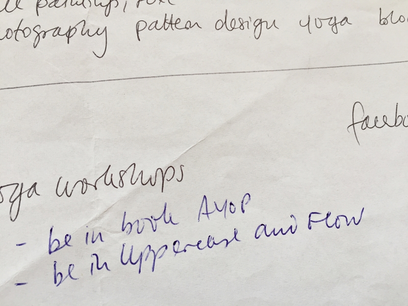
In November 2014 I took an e-course called ArtBiz with Alena Hennessy. One part of this course was mapping out your short-, middle- and long-term goals for your art career. There were all those goals like website, business cards, social media, exhibitions, licensing etc. and at the bottom of the piece of paper I wrote this, like for some day:

Cathrin Gressieker_business plan

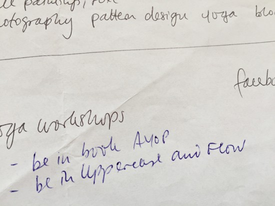
I did what I could do for my short-term goals, like having business cards, and then put my business plan somewhere in a drawer and forgot about it. A good year down the creative road I have accomplished most of my goals and enjoying it. AYOP stands for A Year of Painting and I blogged about being published in this beautiful book last week.

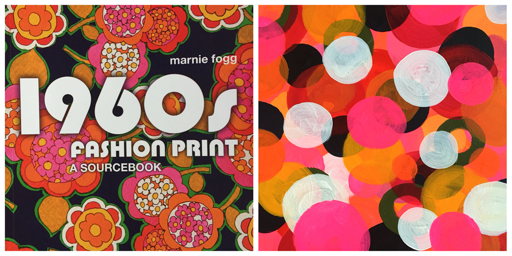
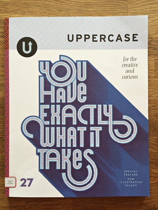
In October last year I got a facebook message from another AYOP artist telling me that she had seen my business cards on page 59 of the latest Uppercase issue. What?

Cathrin Gressieker_Uppercase1

There they were, right in the middle.

Cathrin Gressieker_Uppercase2

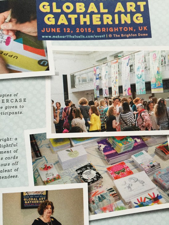
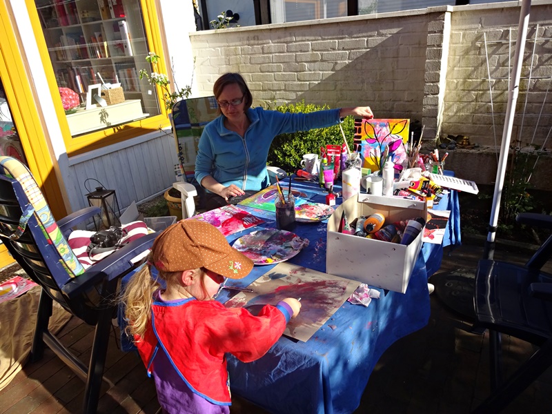
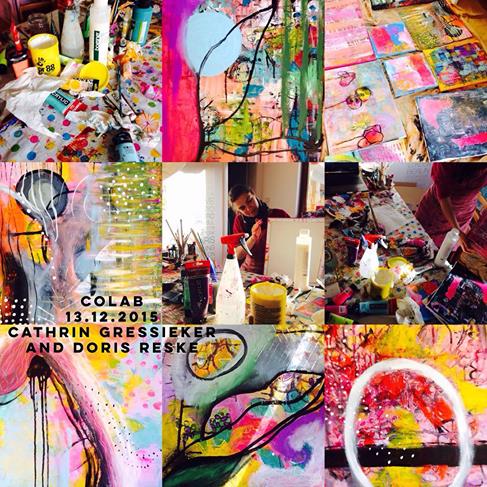
I had attended the Global Art Gathering in Brighton in June (blogged here) and not only had this been an awesome adventure in itself where I met cool artists, designers and friends – it became my first Uppercase magazine entry, quite unintentional, but there you go.

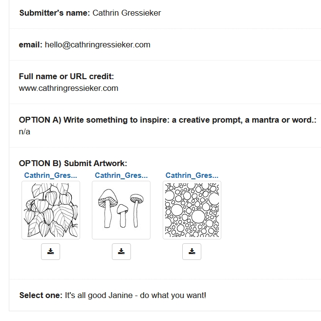
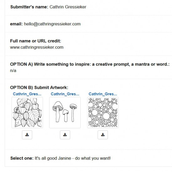
That is an important aspect of goals, I learned – be as specific as you can get. I went on the Uppercase website, where you can always send submissions, idea pitches and portfolio reviews. Every couple of months the editor Janine Vangool has also open calls for other projects, as I saw on that day – for the Uppercase Creative Calendar 2016. You could submit either three little pieces of artwork or write three creative prompts, mantras or a word. I submitted some artwork and got this acceptance e-mail:

Cathrin Gressieker_Uppercase3
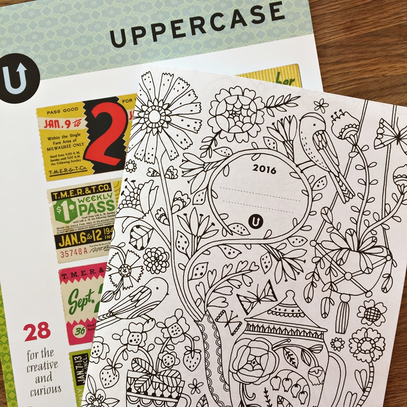
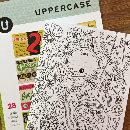
And today Uppercase issue 28 safely arrived from Canada here in Northern Germany.

Cathrin Gressieker_Uppercase4

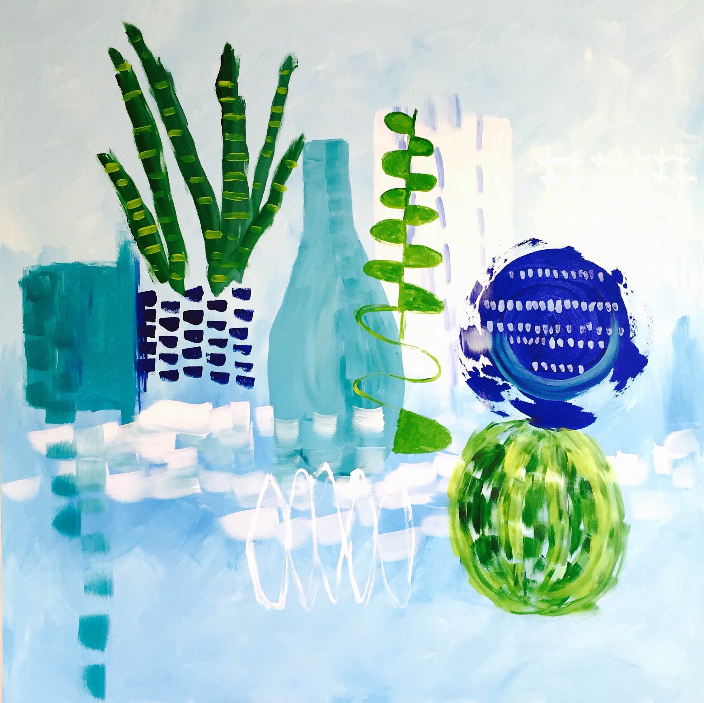
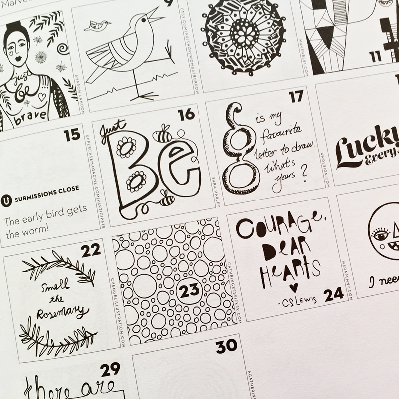
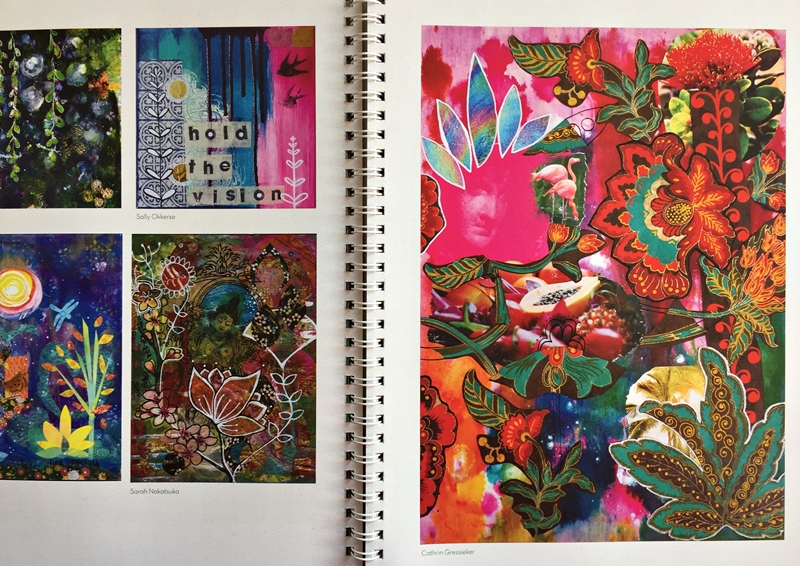
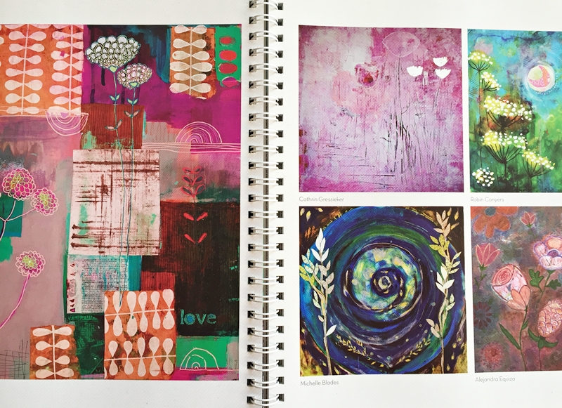
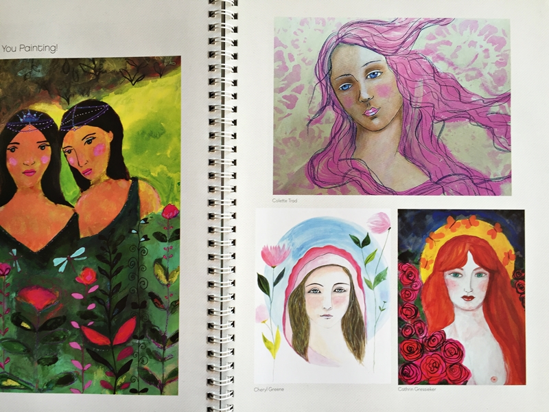
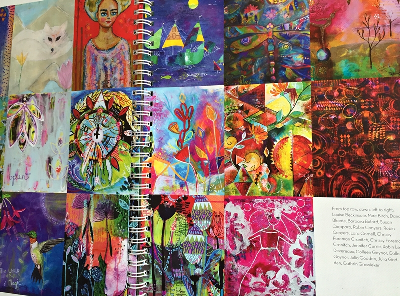
The calendar is a wonderful mix of illustrations and prompts with so much international talent included and in Janine’s words: “This is not a day planner, but rather a place to encourage creative thinking and dreaming.”

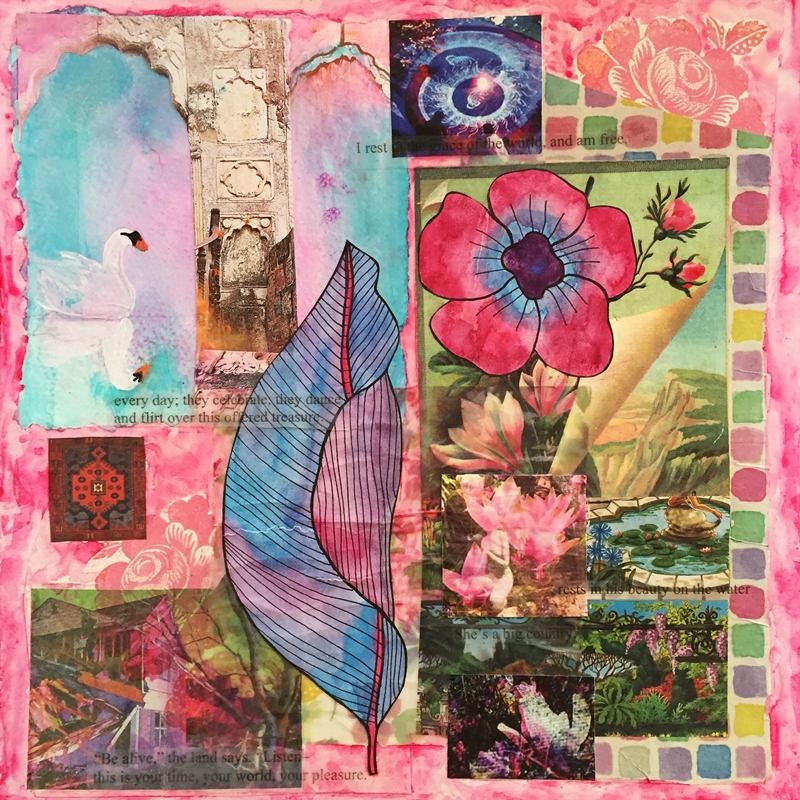
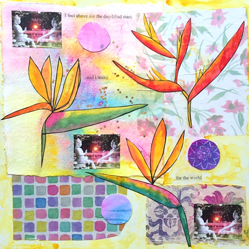
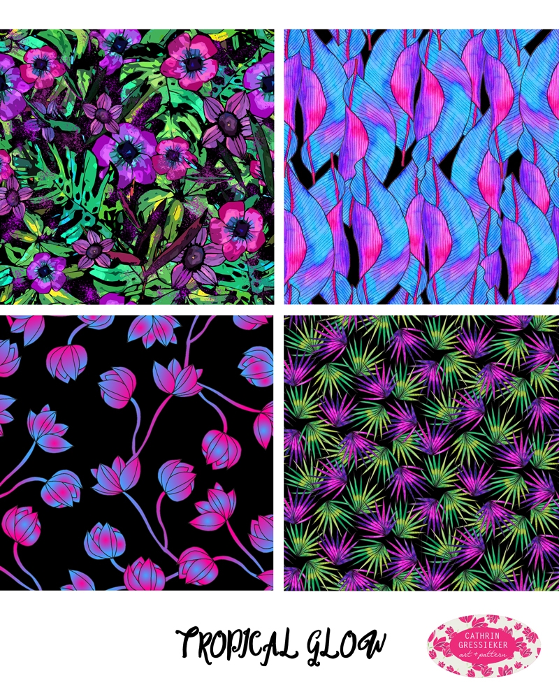
You can find my little pattern in my month of birth – June.

Cathrin Gressieker_Uppercase5

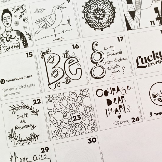
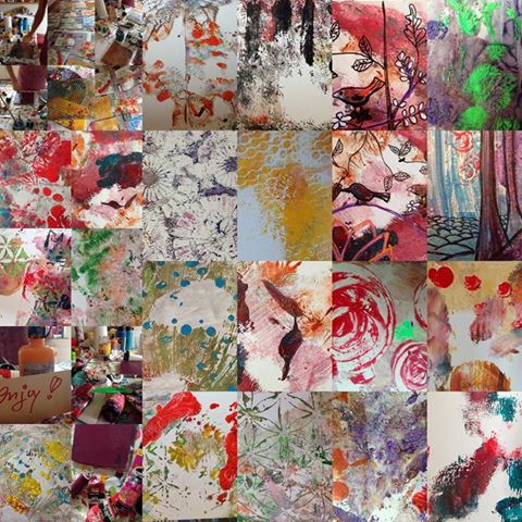
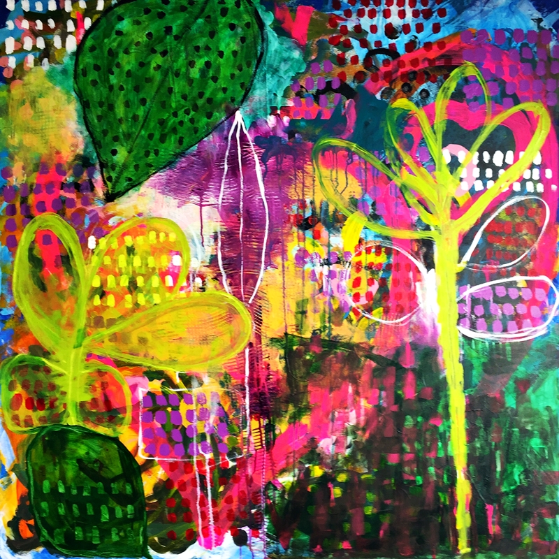
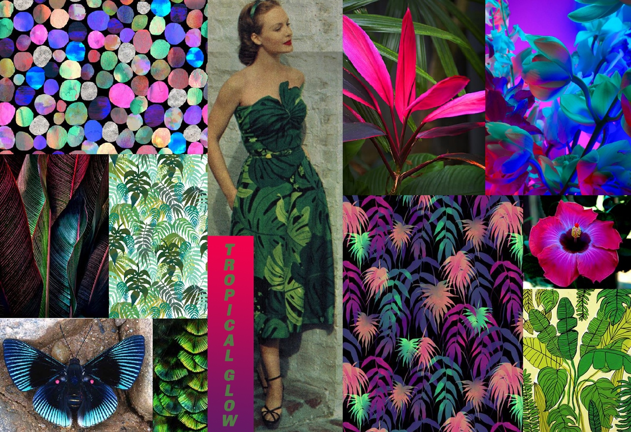
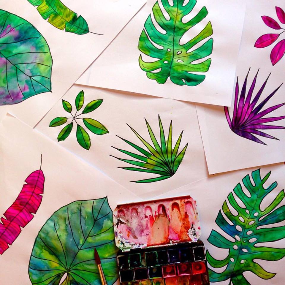
Number 23 was the initial sketch for my Bacteria Night Party pattern. It is time to party now and then think and dream of new ideas. And you know what? There is a new open call on the Uppercase website – for bookmarks.

Share
  • Pin it
  • Share
  • Tweet
  • Share
  • Email
  • Print
Jan142016Jan 14 2016

January Painting 2.0

Fresh beginnings in 2016 – I have rearranged my studio space lately, with my design work in one room and my messy painting space in the adjacent room.

Cathrin Gressieker_studio

I started working on my canvas in a great mood with lots of colourful mark making and listening to music.

Cathrin Gressieker-week1 canvas

There were already so many layers on it and the layering of paint and later shapes went on and on and on … and it didn’t feel right and wouldn’t click into place. I had a lot of patience and trust as I know that some paintings really take time to tell you what they want to become. And this painting just didn’t want to be bright and colorful. So I took a big brush and a lot of white paint.

Cathrin Gressieker_January2
January Heart, acrylic on canvas, 100x100cm

The children didn’t like it (and they usually like everything I do), hubby didn’t like it, but you know what – I like it. I love it. The painting feels like I want it to feel. And I feel it.

But when I was finished, it started dawning on me – I had painted this painting before! Kind of, last January. Similar colours, similar shapes, similar feel. Must be January.

Share
  • Pin it
  • Share
  • Tweet
  • Share
  • Email
  • Print
Jan92016Jan 10 2016

I can call myself a Published Artist now

It’s here, at last! My copy of Alena Hennessy’s new book Intuitive Painting Workshop has made its way to Germany into my mailbox.

Cathrin Gressieker_book1

And it is a special book, for sure. This weekend it has been almost exactly two years that “by coincidence” I stumbled upon a video lesson for Alena Hennessy’s painting course A Year of Painting and embarked on this painting adventure, picking up my old brushes and dried-out paints again after a couple of years of hibernation and totally painted my heart out for a year. Alena is a very gifted and gentle teacher and soul and I happily looked forward to every new painting lesson. And the very supportive e-course community soon became one of my favourite places to hang out online.

Cathrin Gressieker_book2

Apparently, Alena’s publishers quite liked what we were doing in the course. So in November 2014 Alena started working on her third book, based on this course, and the painters in her course were invited to send in work with the chance of being published. I was on vacation on Gran Canaria at this time, but the person I am, who likes to “work” on vacation (always feels like play, anyway), I had my laptop with me with all my saved art files and could send them my selection.

Cathrin Gressieker_book3

Publishing a book takes time and my (creative) life went on with more paintings and patterns and the idea of the book was only a vague concept in my mind – until the book came out in early December 2015 in the States and I saw first glimpses of it on other student’s blogs and facebook accounts.

Cathrin Gressieker_book4

So now I am very honoured to have four of my paintings published in this beautiful book along with the work of my awesome co-artists in the course and I couldn’t say it better then the amazing Susan Ciappara (aka Suki Kapinao) wrote in her amazon review: “An enchanting tome filled with the magic of creativity, color and inspiration and loving support that I experienced being in the authors online painting courses over the last few years. It really captures the sense of community and cross inspiration that occurred in this tight knit group of emerging artists. We found our voices in this wonderful environment facilitated by Alena – and to see it all together is extraordinary and inspires me to keep going with all that I learned. I have watched all these women blossom and grow and sparkle and shine and how nice to now have this book to commemorate it all. Kudos, Alena! – and all my A Year of Painting sisters!”

Cathrin Gressieker_book5

And a little quiz at the end – which one of these paintings could be mine? If you know me a bit and my favourite colour – easy!

Share
  • Pin it
  • Share
  • Tweet
  • Share
  • Email
  • Print

Posts navigation

Previous Page 1 2 3 4 5 6 7 … 16 17 Next Page

about me

Hello, thanks for stopping by. This is a space where I share my colourful adventures in pattern design, painting and travelling.

Recent Posts

  • Bye bye Blog
  • #the100dayproject 2020 Recap, Timelapse and the exciting things that come next!
  • 3 new things I learned in 2019
  • Albania Sketchbook
  • Marrakech Sketchbook
  • Licensed Designs for 24Bottles
  • Licensed Designs for Plum Practicewear
  • #the100dayproject 2018 Days 51-100
  • Licensed Tropical Design for The Planner Society
  • #the100DayProject 2018 Days 1-50
  • Featured Designer on Patternobserver in cooperation with SURTEX
  • Fashion Collaboration with Isy B. Design / Cayman Islands
  • Print Collaboration with Happycloth
  • Licensed Design for Shakti Shanti Yoga Wear
  • #the100dayproject 2017 100/100!!!
  • New Licensed Designs for FLEO
  • Summer in Cuba
  • #the100dayproject, days 37-81
  • CoLabs, Year Two
  • #the100dayproject, 27 Days later

Instagram

“Our deepest fear is not that we are inadequate. “Our deepest fear is not that we are inadequate. Our deepest fear is that we are powerful beyond measure. It is our light, not our darkness that most frightens us. We ask ourselves, ‚Who am I to be brilliant, gorgeous, talented, fabulous?‘ Your playing small does not serve the world. There is nothing enlightened about shrinking so that other people won’t feel insecure around you. We are all meant to shine, as children do. And as we let our own light shine, we unconsciously give other people permission to do the same. As we are liberated from our own fear, our presence automatically liberates others.” 
― Marianne Williamson

#letyourlightshine #quoteoftheday #danceillustration
I had a private art sale last week and look - thes I had a private art sale last week and look - these paintings found a new home 🏡 🖼️ 💫

#soldart #floralartist #artsale
For all my ginger-haired friends out there! I am s For all my ginger-haired friends out there! I am still enjoying painting dance-related scenes and I hope you enjoy the little break from flowers too.

#danceart #underwaterlove #gingerhair
The fourth and last print I designed for the lates The fourth and last print I designed for the latest @caftanist collection - I am proudly presenting ‘Dreamy Ivy’

All hand-painted in acrylic, it made its way from my painting table in Northern Germany to Malaysia 💫 and look, so many style options to choose from, wow!

#textiledesign #artlicensing #floralartist
Reach for the stars - always. You are part of the Reach for the stars - always. You are part of the universe.

#collageart #danceart #reachforthestars
Here is another look at ‘Perfect Poppy’, my fa Here is another look at ‘Perfect Poppy’, my favourite print I designed for the latest @caftanist collection 🌸

Would you have guessed that I painted these flowers digitally, solely on the iPad? While most digital artists prefer Procreate, I love Adobe Fresco for its unpredictable watercolour brushes which bring much of the beauty and magic of real watercolours 🎨💫

For those of you who are interested in trying digital watercolour painting on the iPad I have a whole beginner class on @skillshare on this topic where we will paint crocuses in the snow, a little harbinger of spring. You can find the link to the class in my bio linktree ⬆️ It also gives you a month on Skillshare for free, with access to all my classes and thousands more.

#textiledesign #artlicensing #floralartist #digitalpainting #skillshareclass
I am channeling my inner Matisse here who said col I am channeling my inner Matisse here who said collage is like ‘drawing with scissors’.
Do you know his famous painting ‘Dance’ ?

#danceillustration #bluecollage #inspiredbymatisse
That might be my favourite print I designed for th That might be my favourite print I designed for the @caftanist collection - ‘Perfect Poppy’

#textiledesign #floralartist #artlicensing
🎨 Join me on January 13th ET with @etchr_studio 🎨 Join me on January 13th ET with @etchr_studio for an art session on:⁠
⁠
✨ The quickest way to create stunning portraits⁠
🌈 Using coloured pencils, markers, crayons, watercolour, and acrylics⁠
📏 Identifying facial proportions⁠
😊 Adding expression with simple marks⁠
🖼️ Considering negative space in your composition⁠
🎨 Choosing simple yet effective color palettes⁠
⁠
Ready to paint with me? Click the link in my bio linktree to learn more! 🖌️ ⁠
⁠
#Etchr #EtchrStudio #ArtWorkshop #CathrinGressieker #Artistry #CreativeSession⁠
⁠
https://learn.etchrstudio.com/programs/cathrin-gressieker-nostalgic-little-portraits-in-multi-media
Follow on Instagram
This error message is only visible to WordPress admins
There has been a problem with your Instagram Feed.
All images are the copyright of Cathrin Gressieker. Please don't reproduce any images without permission.
Angie Makes Feminine WordPress Themes