It is this time of year again – the design summer school with Make it in Design.
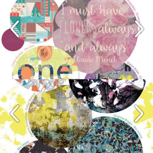
Shortly before this year’s briefs were sent out, they published their Surface Pattern Design Lookbook Volume 2 and I was delighted that two of my patterns from last summer’s school were published in it. You can find my designs on page 15 and 20.
But no time for resting on my laurels, I subscribed to all of the three offered tracks, beginner, intermediate and advanced, you never know what’s in store and what could be fun and fit my style – or make me try something new. The briefs were full of trends for the coming summer next year, with a lot of inspiration from trend companies like WGSN and Patternbank (by the way, do you know, that I license some of my designs with them).
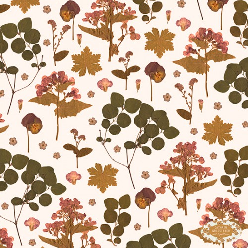
For the first design round I focused on a brief called Honest Meadow Land and developed a pattern with dried flowers, that I had picked and dried in spring and had just waited for their pattern time to come:
I wanted to give the pattern the look of an aged and faded botanical book, so I tried different filters in Photoshop to achieve the effect. You can see the whole gallery with all the beautiful entries here.
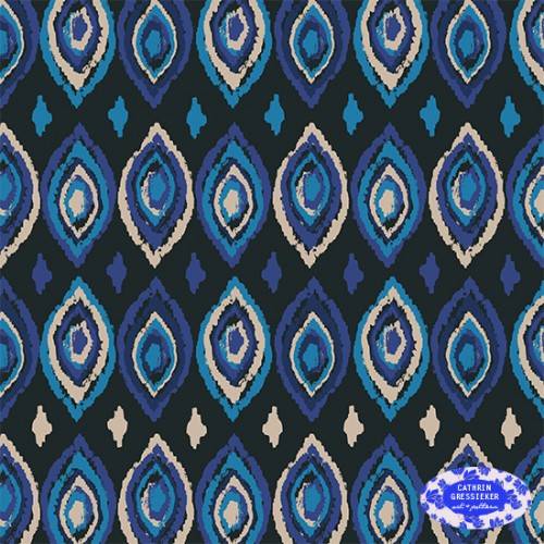
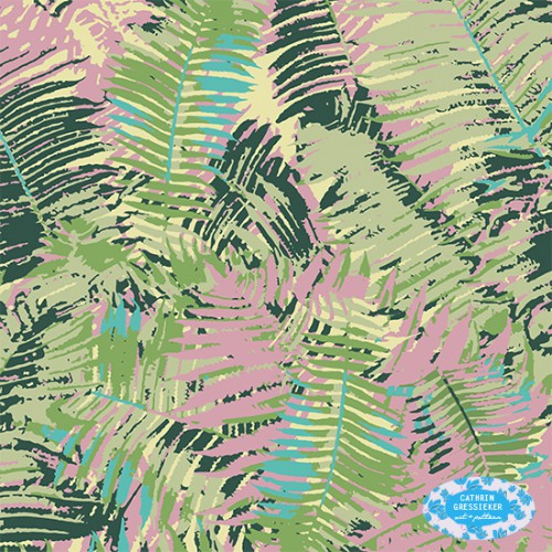
For the second design round I developed three pattern concepts according to the briefs. I challenged myself to only use colours from the provided colour palettes and see what could look good together.
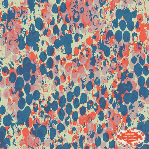
Honest Hand Marks gallery here
(that’s actually the result of me playing with bubble wrap textures)
Escape/Souk gallery here
(this pattern is based on a sketch from my recent Montenegro travel sketchbook)
Treasured / Summer Botanicals gallery here
(here I worked with a new technique I recently learned in Illustrator, with converting photos to textures and colouring them)
That was an inspiring month of August that made me experiment with new techniques, themes and colour palettes. And it is always fun to design summer pattern, simply my favourite time of year.
